作者:吳祐賓

DevExtreme 學習心智圖
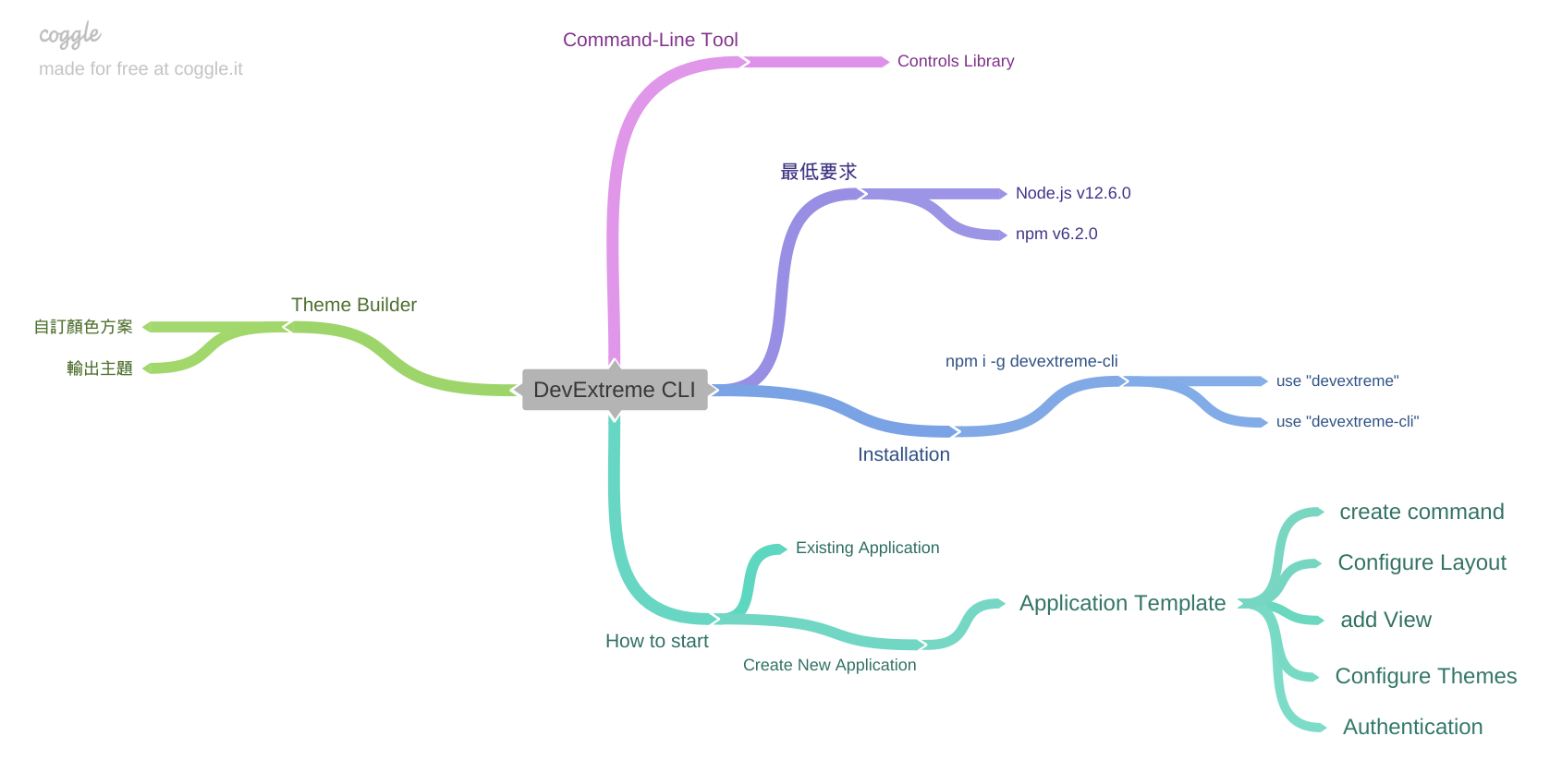
DevExtreme 是個很適合做後台的函式庫,官方的說明文件寫得很齊但也很零碎,整理文件後再繪製成心智圖方便學習。
本文內容參考來源:Create a DevExtreme Application
如果你使用 DevExtreme 模板從頭建立專案。它是個帶有導覽列和數個支援響應式佈局的展示視圖之簡單應用程式。
你能使用 DevExtreme CLI 建立應用程式:
# Creates a new DevExtreme React application
npx -p devextreme-cli devextreme new react-app app-name

# or The pnpm equivalent of this is
pnpm dlx devextreme-cli new react-app app-name

cd app-name
npm run start
應用程式已經有 DataGrid 和 Form 元件。你能在【src\pages\display-data\display-data.js】和【src\pages\profile\profile.js】檔案中找到其設定配置。
有關 DevExtreme React 元件更多資訊,請參考下面的資源:
要了解更多有關 DevExtreme React 模板的結構和內容等資訊,請繼續閱讀本文章。
目錄
- Layouts 佈局
- Add a New View 加入新視圖
- 手動加入 View
- Configure the Navigation Menu
- Add a Custom Toolbar Item 加入自訂工具列項目
- Configure Themes 主題配置
- Authentication 驗證
- Create an Empty Application 建立空白應用程式
- See also
Layouts 佈局
應用程式包含兩種佈局,兩者差異僅在工具列出現的位置不同。
-
Outer Toolbar 外顯工具列(預設值)


-
Inner Toolbar 內置工具列


要以內置工具列的方式建立新應用程式時,可以標記【--layout】設定為【side-nav-inner-toolbar】:
1 |
npx devextreme-cli new react-app app-name --layout=side-nav-inner-toolbar
|
要在建立應用程式後切換另一個佈局時,請開啟【src\Content.js】檔案,把 import
區塊裡的【SideNavInnerToolbar】替換為【SideNavOuterToolbar】:
1 2 3 4 5 |
/* Content.js */ import { SideNavInnerToolbar as SideNavBarLayout, SingleCard } from './layouts'; |
Add a New View 加入新視圖
執行以下命令加入新視圖。【--icon】可以指定自
DevExtreme icon library
裡任一圖示。
1 |
npx devextreme add view view-name [--icon=IconName] |
你會在【src\pages】目錄下找到已加入的視圖。此命令也會在【src\app-navigation.js】檔案中,為已加入的視圖建立其導覽選單項目。
手動加入 View
不想依賴 DevExtreme-CLI 建立 View 也可以,只要了解 DevExtreme Application Template 對於 View 建立的架構,很快就能建立起來。app-navigation.js 建立 UI 選單內容;app-routes.js 定義應用程式路徑;pages 目錄下建立 View 內容。結構分析後我整理出如下心智圖內容。

Configure the Navigation Menu 導覽選單配置
Configure Menu Items 選單項目配置
編輯【src\app-navigation.js】檔案以配置導覽選單項目。每一項目皆有如下欄位:
- text - 項目文字
- icon - 項目圖示
- path - 項目所關聯的導覽路徑
- items - 子項目
注意:選單項目應在【導覽至頁面】或【包含子項目】中選擇一種。其原因為不能指定【path】和【items】放在同一個選單項目中。
1 2 3 4 5 6 7 8 |
    {
        text: 'Category',
        icon: 'folder',
        items: [{
            text: 'About',
            path: '/about'
        }]
    }
|
Hide the Menu in the Closed State 在關閉狀態下隱藏選單
在關閉狀態下,導覽選單會留下部份空間使圖示出現。如果你的選單項目不包含圖示,則可以隱藏選單。作法是,開啟【SideNavOuterToolbar】或【SideNavInnerToolbar】元件(取決使用何種佈局),找到【Drawer
配置】並設定【minSize】選項為 0:
1 2 3 4 5 6 7 8 9 10 11 12 13 |
/* side-nav-outer-toolbar.js */ // ... export default function ({ title, children }) { // ... return ( <div className={'side-nav-inner-toolbar'}> <Drawer ... minSize={0}> {/* ... */} </Drawer> </div> ); } |
選單寛度設定為自動調整
導覽選單寛度預設為 250px。如果你需要配合選單項目文字長度自動調整其寬度,則可以按以下步驟進行設定:
- 開啟【SideNavOuterToolbar】或【SideNavInnerToolbar】元件(取決使用何種佈局),找到【Drawer 配置】並設定【maxSize】選項為 null,或是刪除 maxSize 屬性。
- 開啟【side-navigation-menu.js】,找到【TreeView 配置】並設定 scrollDirection={"both"}。
-
開啟【side-navigation-menu.scss】,.side-navigation-menu 的 width
屬性設定為【auto !important】。
注意!此模板並沒有對選單寬度進行最佳化調整,官方說明如下:
consider one of the following options:
- display ellipsis for items with long text and implement tooltips
以"提示方式"取代過長的顯示內容
- wrap item text into multiple lines
採用多行顯示
請參閱:Drawer - Adopt width according to the width of the menu component
Add a Custom Toolbar Item 加入自訂工具列項目
在這應用程式模板中使用到 DevExtreme Toolbar
工具列元件。工具列是【Header】元件的一部份,它的配置內容在【src\components\header\header.js】檔案中。可以在其
Toolbar 標籤內加入【Item】項目元素,更多的【Item】屬性請參考
Items
幫助說明。
下面程式碼展示加入搜尋按鈕到 Toolbar 中:
1 2 3 4 5 6 7 8 9 10 11 12 13 14 15 16 17 18 19 20 21 22 23 24 25 26 27 28 29 30 31 |
/* header.js */ // ... export default ({ ..., search }) => ( <header className={'header-component'}> <Toolbar className={'header-toolbar'}> {/* ... */} <Item location="after"> <Button icon="search" onClick={search} /> </Item> {/* ... */} </Toolbar> </header> ) /* side-nav-outer-toolbar */ // ... export default function ({ title, children }) { // ... const search = useCallback(() => { console.log("search"); }, []); return ( <div className={'side-nav-outer-toolbar'}> <Header ... search={search} /> {/* ... */} </div> ); } |
上面的程式碼中,定義了按鈕處理程序在【SideNavOuterToolbar】元件裡。它適用在外顯工具列佈局中。若使用內置工具列佈局,則把相同的程式碼放在【SideNavInnerToolbar】元件裡。
Configure Themes 主題配置
切換主題
DevExtreme React 模板使用基本主題顯示內容和額外主題(調色盤 color
swatch)在導覽選單。要切換主題時,請開啟【src\themes\metadata.base.json】或【src\themes\metadata.additional.json】檔案,並分配主題名稱到【baseTheme】欄位:
1 2 3 4 5 6 |
/* metadata.base.json */ { // ... "baseTheme": "material.blue.light", // ... } |
你可以在 Predefined Themes 幫助章節可以找到所有主題名稱。(主要分為 Generic 和 Material (預設) 主題,可參考 Material-UI 官網)
建立自訂主題
你能使用 DevExtreme ThemeBuilder 建立基於預定義主題的自訂主題。步驟如下:
- 匯入【src\themes\metadata.base.json】或【src\themes\metadata.additional.json】到 ThemeBuilder 中。
- 自行定義主題。
-
輸出主題元資料到初始檔(參閱
Postpone Customization)。
在【切換主題】或【建立自訂主題】後,只要執行下述指令即會重新編譯主題,在啟動應用程式後會看到變換的主題樣式。
1 |
npm run build-themes
|
套用 Color Swatch 調色盤
調色盤是基本配色案中的輔助配色方案。
在 DevExtreme React Template 中,調色盤應用在導覽選單並在【src\themes\metadata.additional.json】檔案中進行配置。欲套用調色盤到元素時,請加入【dx-swatch-additional】類別到該元素。
1 2 3 |
<div className={'dx-swatch-additional'}> <!-- Your content here --> </div> |
套用主題變數到自訂元素
主題變數(Theme variables)定義在【src\themes\generated\variables.base.scss】和【src\themes\generated\variables.additional.scss】檔案中。 把它們套用到自訂元素,以使自訂元素保有和應用程式有一致的外觀。
底下的程式碼展示套用【$base-accent】變數到 my-element 的 background-color 屬性中:
1 2 3 4 5 6 |
// Your SCSS file @import "../../../themes/generated/variables.base.scss"; #my-element {
background-color: $base-accent; } |
Authentication 驗證
DevExtreme React 包含認證功能的畫面和 API。已配置客戶端路由,這能讓未經認證的使用者只能被導引到認證相關畫面。這些畫面允許使用者登入、建立使用者帳號或變更密碼。認證頁面由【NonAuthenticatedContent.js】元件渲染。其餘頁面由【Content.js】元件渲染。
注意!不要過渡依賴客戶端路由保護你的應用程式以免受未經認證的存取。應在後端上驗證使用者憑證。
整合到後端
後端請求的存根驗證功能內容位於【api】目錄中。更新這些功能來向你的後端發出請求。
每個驗證功能所回傳的物件,其欄位說明如下:
| 欄位 | 說明 |
|---|---|
| isOk | 布林值。請求成功時為 Ture,以外皆為 False。 |
| message | 錯誤訊息(假如錯誤發生時)。 |
| data | 請求回傳的使用者資訊。 |
取得使用者資訊
使用者資訊儲存及定義在【contexts\auth.js】模組中。
要從應用程式的任何地方存取使用者資訊,請使用【useAuth】hook。此 hook 所回傳的物件,其欄位如下:
| 欄位 | 說明 |
|---|---|
| user | 當前使用者資訊物件;未認證使用者時為 undefined。 |
| setUser | 當前使用者資訊的更新方法;接受新的使用者資訊物件。 |
| loading | 布林值。使用者資訊載入後為 True(在 HTTP 請求過程中)。 |
底下程式碼展示【useAuth】hook 如何存取使用者資訊:
    import { useAuth } from './contexts/auth';

    export default function() {
        const { user } = useAuth();
        if (user) {
            // User is authenticated
            ...
        }
        ...
    }
Create an Empty Application 建立空白應用程式
要產出一個不帶視圖和導航選單的應用程式,請使用【--empty】標記:
npx devextreme-cli new react-app app-name --empty
See also
沒有留言:
張貼留言